A little dated, this 2012 article by the Guardian on death tolls in Syria is a good example of having good data visualization but poor implementation. Let’s take a look at the initial view on a Google Chrome browser.
Right! So, not so bad. We have a nifty intro text by Mr. Rogers here along with a byline, some share buttons, an infographic and a sidebar. The byline is in an odd place, mainly because we have the multimedia element below it…so I don’t really understand why the byline wouldn’t be below that.
Everything else is on par with the Guardian’s usual setup. I feel like this could be improved. The share buttons are looking a bit antiquated and I think they could be modern/minimalistic-looking. The sidebar is a bit sparse too.
The infographic itself, which is actually a bit of a video, is very nice. It shows day-by-day deaths in Syria between 2011 and 2012 and is very telling.
Okay, so let’s move onto what’s next! Annnnnd…
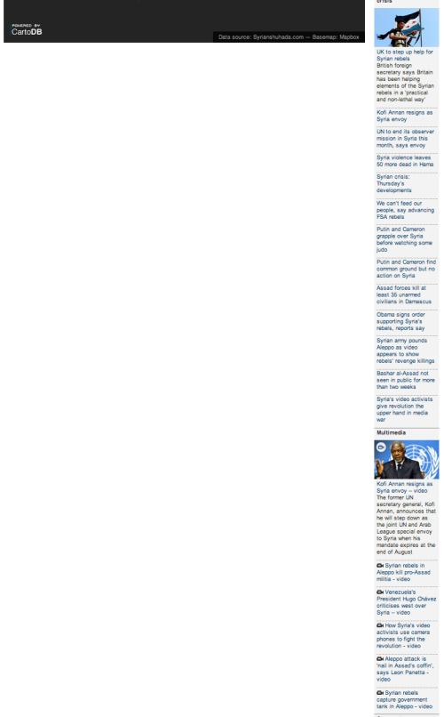
Nothing. (Besides a sidebar).
That’s not very good. Let’s look a little lower.
Ah! There’re the comments. Okay, so that’s a bit of a stretch. There’s no reason for all of that white space. They should have either put some more text in there giving context to the infograph, orrrrr moved the comments up.
Other than that, we have normal footer-type-elements for any news site with important links and an ad at the bottom. Basic, and not very innovative, but it gets the job done.
Overall, I think the site did well in providing the information that they wanted to, but they could have formatted their site a bit better for its presentation.


